Imports
import numpy as np

import qplot as qp
Preparing the data
(Here we just make up some data for the demonstration.)
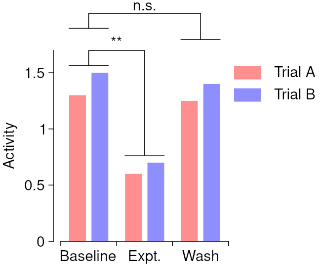
yy = np.array([[1.3, 1.5], [0.6, 0.7], [1.25, 1.4]])
Plotting
qp.figure('eg_bars', 3, 2.5)
# Prepare for generating a legend
qp.legopt(x0=2.6, y0=1.5)
# Plot the pink bars
qp.brush('955')
qp.pen('none')
qp.bars(np.arange(3) - 0.2, yy[:,0], .3)
qp.plegend('Trial A')
# Plot the blue bars
qp.brush('559')
qp.bars(np.arange(3) + 0.2, yy[:,1], .3)
qp.plegend('Trial B')
# Plot the axes
qp.pen('k', 0.5)
qp.xcaxis('', np.arange(3), ['Baseline', 'Expt.', 'Wash'])
qp.yaxis('Activity', qp.arange(0, 1.5, .5), x=-0.5, lim=[0, 1.7], axshift=5)
# Plot the significance annotations
ym = np.max(yy, 1)
dy = [ np.nan, 5, 30]
txt = ['', '**', 'n.s.'] # For real data, this obviously requires more care
for k in [1, 2]:
qp.shiftedline(0 + 0.35*np.array([-1, 1]), ym[0], 0, -dy[k])
qp.shiftedline(k + 0.35*np.array([-1, 1]), ym[k], 0, -dy[k])
qp.shiftedline(np.array([0, 0, k, k]), ym[[0,0,0,k]],
0, -dy[k] - np.array([0, 10, 10, 0]))
qp.at(np.mean([0, k]), np.max(ym[[0, k]]))
qp.align('center', 'bottom')
qp.text(txt[k], dy=-dy[k] - 12)
# Make sure annotations fit inside bounding box